Pie / Donut Charts
Pie charts are used to show how parts of a data set relate to the whole data set.
About
Pie charts are often used because they are familiar to users. However many data experts are against pie charts because they are hard for humans to compare differently sized slices accurately. Pie charts could still be an option if you are showing three or less categories. If you need to show 4 or more categories consider using a bar chart or treemap instead of a pie chart.
When deciding to use a pie chart or not think of the users needs. If you can answer yes to the 2 questions below a pie chart may be a visual to consider:
- Do they need a quick glance at the data? (verses the need to dive deep into the data)
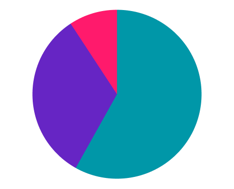
- Are you showing 3 categories or less?
If you decide to show a pie chart: When creating a pie chart start at the 12 o’clock position and display the individual categories in a clockwise patten in a way that makes the most sense in your instance. Example: if you were displaying age ranges you might want to start at the youngest age range at 12 o’clock then the next age range, and next after that. Some cases you may want to display in alphabetical order or even from largest value to smallest.
Pie Vs Donut
Donut charts are the same as pie charts except the middle is punched out. Some say a donut chart can be easier to read since this removes the angles in the middle, however I have not seen scientific evidence that backs that up. We view the donut chart as an aesthetic choice by the designer, perhaps to add text to the middle or as a way to rude the amount of “ink” used on the visual.
Sample
Dos & Don'ts
Do
Do use a donut chart with 3 or less categories
Don't
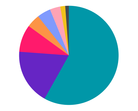
Don’t use a pie chart with 5 or more categories. It becomes hard to process too many categories in a chart.
Do
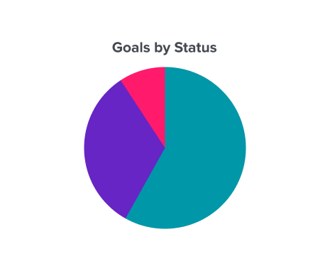
Do use one pie chart for per story
Don't
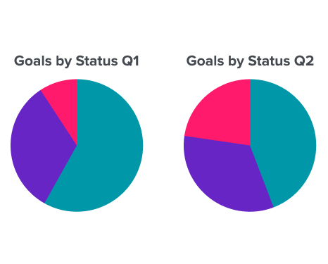
Do not use multiple pie charts per story. Users will have a hard time if they have to glance back and forth between pie charts