Line / Area Charts
If you have continuous data that you would like to represent through a chart then a line chart is a good option. This graph is especially effective when trying to identify a trend or pattern in your data.
About Line Charts
Unlike bar charts, line graphs axis do not have to start at 0. For line graphs you may start the axis at a number higher or lower than 0 to best illustrates the point.
There are no set rule on how many lines a graph may have but if there are a lot of lines consider using a color or two the emphasize just the import data. Also if there are a lot of lines you may consider removing some to showcase only the important aspects.
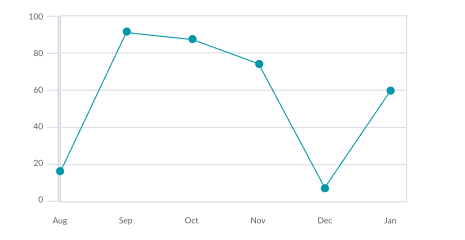
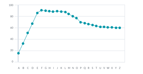
Chart Sample
Area Charts
Area Charts are Line Charts with area below filled in, giving it more visual weight. Area charts can also be thought of as bar charts where the bars have infinitely thin widths and thus should always have an axis that starts at 0. Try to avoid area charts when displaying more than 1 categorie.
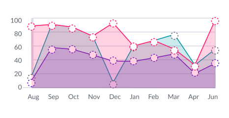
Chart Sample
Dos & Don'ts
Do
Do use data markers when possible. Data markers default shape should be circles since they are perfectly symmetrical, however other shapes may be used to address accessibility concerns.
Don't
Don't use data markers if they clutter the UI so much that it become unreadable

Do
Do use area charts when showing less than 2 catagories.
Don't
Do not use area charts with more than 2 categories. Even with 2 categories it is possible to run into readability issues.