Bar / Column Charts
Bar / Column Charts are one of the most familiar data visualizations, where the width or height of the bar represents the value of the data.
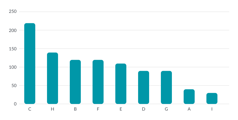
About Column Charts
Bar graphs are used to compare categories or variations among one category. The name “Bar Graph” and “Column Graph” are often used to talk about the same graph. The technical difference is that a Bar Graph has the bars going from left to right, while Column Graphs show data from bottom to top.
If a Bar/Column graph only has one category use one color for all the bars in the visual. Paired Bar, Cluster, stacked, or any other bar graph with multiple categories should use a different color per category.
The data in the Bar/Column graphs maybe organized in whatever manner matters most to the story you are trying to tell. Some examples are to organize the bars from highest value to lowest or in alphabetical order.
Chart Sample
Bar vs Column Graphs
When deciding between bar vs column we generally default to column graph. You may choose a bar graph over a column graph depending on your page layout or the labels in the data. You as the designer will also need to choose the best orientation that will tell the story in the best way possible.
Dos & Don't
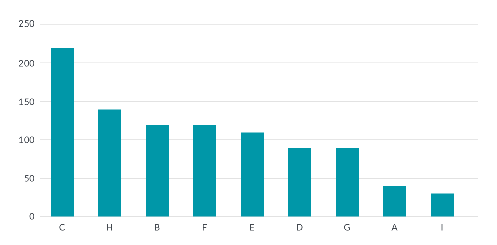
Do
Do start the numerical axis at zero.
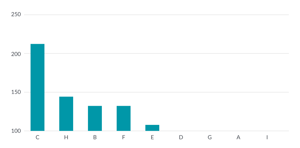
Don't
Don't start at a higher value to emphasize the difference in value and while this may be easier to see the difference we end up with inaccurate data. Using inaccurate data will lead to confusion or possibly bias.
Do
Do use white space to separate individual bars
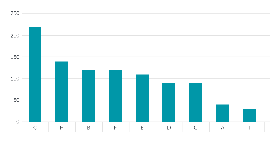
Don't
Do not use tick marks to separate individual bars
Do
Do use grid lines to indicate value numbers
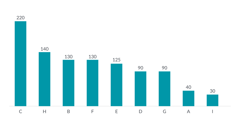
Don't
Do not label individual bars with the value number
Do
Do use square corners on bar graphs (border-radius:0px)
Don't
Do not used rounded corners on bar graphs when needing to show detailed exact counts.
***Rounded corners can be used when showing data that helps the user get an approximate or general value.