Data-Visualization
The representation of information and data using charts and graphs. Data-Visualizations provide an accessible way to understand patterns and trends, as well as outliers, in data.
Best Practice Overview
- Show what matters to your user, find the balance of showing a lot of data and understandable data. (Showing more that 5-8 categories in the data can be hard to understand)
- Whenever possible, create visualizations with real data. A pretty concept doesn't equate to an impactful, real-world visualization.
- Link charts with text alternatives to provide an accessible way to explore data.
- Keep data-visualizations as simple as possible. Remove any unneeded gridlines, markers, shapes, 3D affects, or legends when possible. Simplify numbers and repetitive units. Avoid multi-axis charts.
- Data-Visualizations should only enhance data and solve real problems. Avoid using them just for flourish or enhancing aesthetics.
To Chart Or Not To Chart
Do it when...
- A user needs help navigating complex data.
- The resulting visual make it easy to compare data and tell a story.
- The data being visualized is important.
Don't do it when...
- Summarizing data is unhelpful to users (i.e. data tables).
- The resulting visual doesn't make it easier to understand the data.
- It is only used as a design enhancement.
Chart Types
Should this be a line chart or a bar chart? To pick the right chart type you need to consider what type of data you are showing. Data can generally be placed in these chart types:
- Comparing Categories - Bar Charts, Grouped / Stacked Bar Charts, Heat Map, Sankey
- Time - Line Graph, Area Chart, Slope Chart, Sparkling, Bar Chart
- Distribution - Histogram, Pyramid Chart, Box-and-Wisker Plot
- Relationship - Scatterplot, Bubble Plot, Radar Chart, Matrix, Tree Diagram
- Part-to-Whole - Pie / Donut Chart, Treemap, Stacked Bar Chart, Stacked Area Chart
- Qualitative - Icons, Word Clouds, Bar Chart, Word Tree
- Geospatial - Maps
- Table
The list above is only some of the common ways to show data. Reference datavizproject.com or a more complete list.
Prototyping Downloads
Build out concepts and test assumptions quick by downloading our UI Visualization Kit Below
Figma UI kit
See herePlugin: We use the Chart Plugin for Figma to import csv files into our prototypes.
Samples & Resources
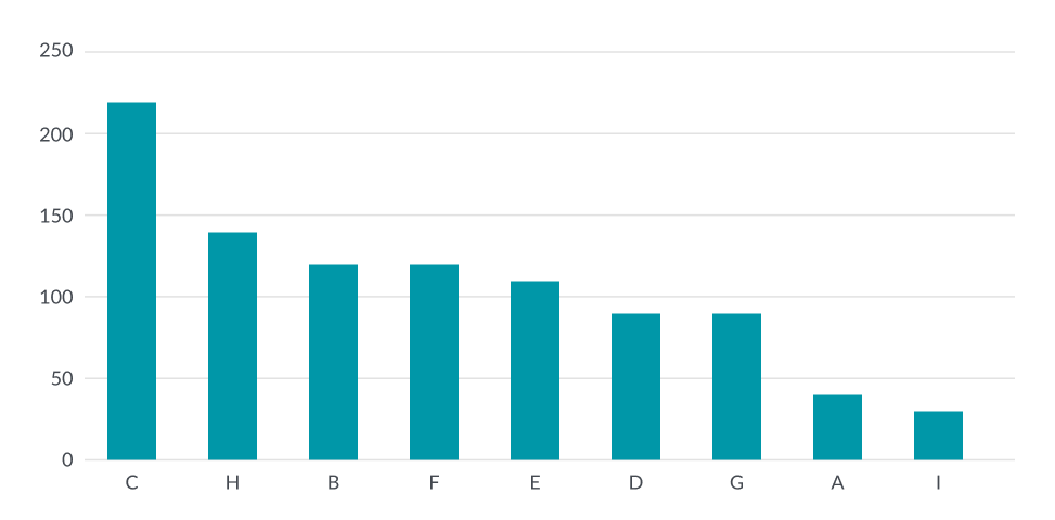
Bar / Column Charts
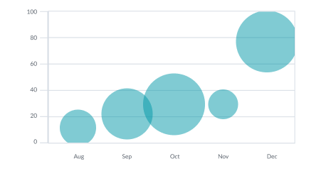
Bubble Charts
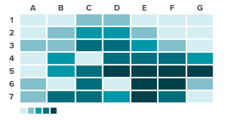
Heatmap
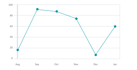
Line Charts
Pie / Donut Charts
Single Bar
Stat Numbers
- StatLabelHere
- 100.00%
Tables
Treemap
External Resources
Examples of other organizations doing great work inside data-visualization.
Colors
The data visualization colors are slightly different from the other branding and app colors. Changes were needed to increase readability and to be more accessible for our color blind users. These colors were created by taking our current branding colors and aligning them to a predefined color blind safe palette while also adding new colors.
Qualitative Colors
Qualitative colors are used to render categorical data, such as gender or race, that has no inherent sequential order.
Teal
Token: $qw-datavis-qual-1
HEX: #0097A8
Class: qw-datavis-qual-1
Purple
Token: $qw-datavis-qual-2
HEX: #6625C4
Class: qw-datavis-qual-2
Pink
Token: $qw-datavis-qual-3
HEX: #FF1A6C
Class: qw-datavis-qual-3
Orange
Token: $qw-datavis-qual-4
HEX: #FC9446
Class: qw-qc-4
Blue
Token: $qw-datavis-qual-5
HEX: #809AFD
Class: qw-datavis-qual-5
Light Pink
Token: $qw-datavis-qual-6
HEX: #ffa3b5
Class: qw-datavis-qual-6
Yellow
Token: $qw-datavis-qual-7
HEX: #F1C21B
Class: qw-datavis-qual-7
Grey
Token: $qw-datavis-qual-8
HEX: #444950
Class: qw-datavis-qual-8
Favorability Colors
| Example | Token | Class |
|---|---|---|
| $qw-datavis-favorable | .qw-dv-favorable | |
| $qw-datavis-unfavorable | .qw-dv-unfavorable | |
| $qw-datavis-neutral | .qw-dv-neutral | |
| $qw-datavis-average | .qw-dv-average |
Sequential Colors
Sequential colors are most commonly used to render a single category of data, such as a bar chart, or when visualizing a complex set of data with many categories.
Teal
| Token | Class | |
|---|---|---|
A |
$qw-datavis-seq-a-1 | .qw-datavis-seq-a-1 |
A |
$qw-datavis-seq-a-2 | .qw-datavis-seq-a-2 |
A |
$qw-datavis-seq-a-3 | .qw-datavis-seq-a-3 |
A |
$qw-datavis-seq-a-4 | .qw-datavis-seq-a-4 |
A |
$qw-datavis-seq-a-5 | .qw-datavis-seq-a-5 |
Purple
| Token | Class | |
|---|---|---|
B |
TBD | .qw-datavis-seq-b-1 |
B |
TBD | .qw-datavis-seq-b-2 |
B |
TBD | .qw-datavis-seq-b-3 |
B |
TBD | .qw-datavis-seq-b-4 |
B |
TBD | .qw-datavis-seq-b-5 |
Heatmap
| Token | Class | |
|---|---|---|
B |
TBD | .qw-datavis-seq-c-1 |
B |
TBD | .qw-datavis-seq-c-2 |
B |
TBD | .qw-datavis-seq-c-3 |
B |
TBD | .qw-datavis-seq-c-4 |
B |
TBD | .qw-datavis-seq-c-5 |
B |
TBD | .qw-datavis-seq-c-6 |
B |
TBD | .qw-datavis-seq-c-7 |
B |
TBD | .qw-datavis-seq-c-8 |
B |
TBD | .qw-datavis-seq-c-9 |
B |
TBD | .qw-datavis-seq-c-10 |
Diverging Colors
Like sequential colors, diverging colors are commonly used to render a single category of data when data values can be ordered from low to high. The key difference however is that diverging colors bring attention to a significant break point in the data. To illustrate this, a different color is used on each end of the value scale and the breakpoint, or middle value, is represented as a neutral color. Data values that are furthest from the break point are shaded darker, while values that are closer are shaded lighter.
Diverging Set 1
| Token | Class | |
|---|---|---|
A |
$qw-datavis-diverge-1 | .qw-datavis-diverge-1 |
A |
$qw-datavis-diverge-2 | .qw-datavis-diverge-2 |
A |
$qw-datavis-diverge-3 | .qw-datavis-diverge-3 |
A |
$qw-datavis-diverge-4 | .qw-datavis-diverge-4 |
A |
$qw-datavis-diverge-5 | .qw-datavis-diverge-5 |
A |
$qw-datavis-diverge-midpoint | .qw-datavis-diverge-midpoint |
A |
$qw-datavis-diverge-6 | .qw-datavis-diverge-6 |
A |
$qw-datavis-diverge-7 | .qw-datavis-diverge-7 |
A |
$qw-datavis-diverge-8 | .qw-datavis-diverge-8 |
A |
$qw-datavis-diverge-9 | .qw-datavis-diverge-9 |
A |
$qw-datavis-diverge-10 | .qw-datavis-diverge-10 |
Layout
Data Viz Layout
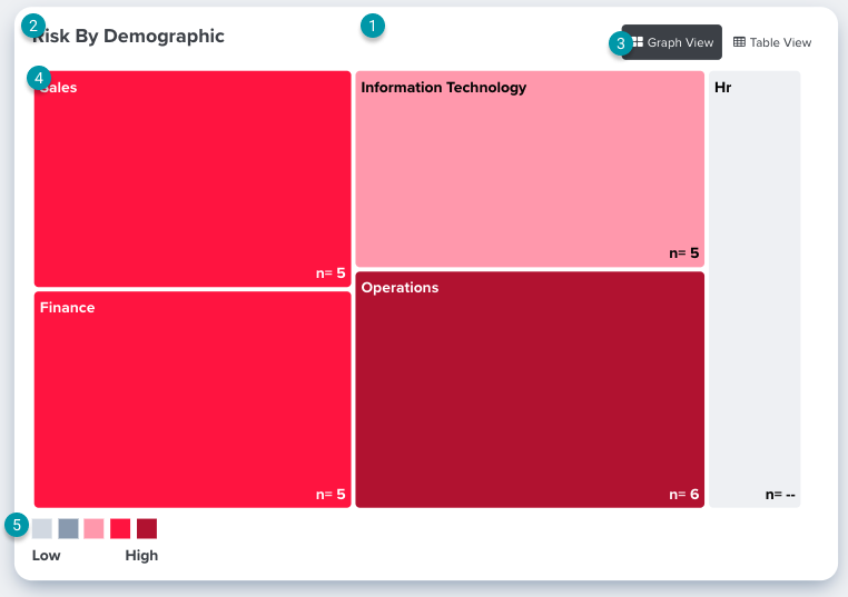
Data visualizations are placed in a card with 16px padding on all sides.
All visualizations need a title, most are given a class of h4 (18px) and the default HighCharts header is hidden.
Additional toggles may be added in the same row as the header. These should be right aligned to the edge of the card.
The actual data visualizations will render below the header row and will take up the full width of the card (This example shows a tree map visual but the same rules apply to other graphs such as line or bar).
If a visual requires a legend or a key they will display below the visual and be left aligned most of the time.
Visualization Libraries
Should your visualization be made in Power BI, HighCharts, or HTML/CSS?
- Power BI - A software from Microsoft used for business analytics to create interactive dashboards and reports. Currently this is only used in our Intelligence Dashboard section of our app by embedding reports via iframe from the Power Bi Desktop app. Read their documentation for more info.
- HighCharts - A JS library used to create interactive data visualizations. The library has many visuals to choose from and they allow for some degree of customization. Most of our data visitations are make with HighCharts. See their demo for more info.
- HTML / CSS - A small number of our visualizations are custom made using HTML/CSS possibly mixed with Bootstrap styles. These are normally reserved for less intensive visualizations like Progress Bars, Tables, and Hero Numbers.
Punchlist:
| Work to Be Done | Description | Status |
|---|---|---|
| Selecting Chart (Dos/Donts) | Inventory current state. Rubric based on data and data controls to decide what visualization to use. Decide whether to use Power-Bi, charting tool, custom HTML or no charting at all. | Started |
| Chart Rules | What can each chart type do? Support slicing AND comparison? Trend WITH Slices? | Started |
| Vocabulary Library |
Trending vs. Comparison vs. Filter vs. Sort Dashboard vs. Report Slice vs. Group By |
Not Started |
| Color/Theme | Mono-chromatic vs. Other. | Complete |
| Accessibility | Connected with "Selecting Charts" | Not Started |
| Localization | Ensuring great UX for different languages | Not Started |
| Data Controls | Sort, Filter, Compare, Location, Etc. | Not Started |
| Data Comparison | Multi-Variant Comparison vs. 1-to-1 Comparison | Not Started |
| Behavior | Tooltips, Popovers, Displaying Data Consistently (decimals) | Not Started |
| Supported Media | PDF, Excel and (gasp) Powerpoint | Not Started |
| Empty State | Not Started | |
| Migration Plan | Changes/Replacing current elements | Not Started |